Slippery Rock University’s website has always been challenging to navigate for students, whether they’ve been at the university for one week or three years.
During the past school year, SRU updated its website to be more aesthetically pleasing, but the counterintuitive navigation that was the trademark of the old website is still present. The new website looks good and is less intimidating to navigate, but is still not functional to incoming and current students.
But students could still function without navigating the actual website as long as MySRU, the portal that students access for everything necessary to their success and development, was intact.
While the old MySRU certainly had its problems, it was easy for students to navigate and find resources they needed, whether it was for ordering textbooks or something as simple as checking their assignments on Desire to Learn (D2L).
While the appearance of the old MySRU wasn’t anything to be excited about, it served its purpose in helping students access things they needed.
Most students had become accustomed to navigating the website, and rarely had issues.
The new MySRU portal is not functional, is difficult to navigate, and could not have come at a worse time in the school year for students, from freshmen to seniors alike.
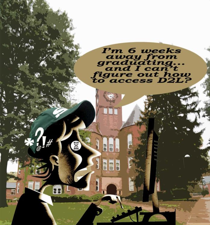
When we were first introduced to the new MySRU over spring break, D2L, the most utilized service by students, was completely inaccessible from the new login page.
This is problematic for a variety of reasons, most being that D2L needs to be the most accessible part of the website so that students can find assignments and monitor their grades. A redesign where this accessibility is not the utmost priority is not a functional redesign, but a useless one.
Now, D2L is accessible, but some Internet browsers are finicky in allowing access through the MySRU login.
While MySRU’s new design is undoubtedly cleaner, by the designers making everything the same color and size, it doesn’t prioritize information. Most students would agree that they utilize their Rock Audit more than they do to change their marital status, but according to the website redesign, these are both things that students should be able to readily access.
Seniors are especially affected by this change, as they have spent the past four years of their life accustomed to navigating MySRU and D2L.
Suddenly, students who are a little under two months away from graduating have to relearn how to find resources and information that they had no trouble locating just weeks ago.
Members of the Rocket staff have heard of students who have difficulty accessing not only D2L, but also their Rock Audit, which shows students’ progression in degree programs and grades.
We get it, the website was outdated and unattractive, 75 percent of the way through the semester is not the time to do something about it. In the future, we hope administration will consider the students before changing the entire design of SRU’s website.


